A site theme gives the pages of ntropy site and ntropy render --to html
your own look. This guide builds one theme, harbor, in seven steps:
colours, a font, corners, an icon, callouts, tables, and a header with a
footer. Each step changes one thing and says what you should see. You need
a vault with a few notes and a web browser. The reference behind it is
Site themes, which lists every
property, class, block, and template variable the steps use, and many more.
Before you start
Every command in this guide runs in the root of your vault:
cd "$(ntropy info -p)"
The steps work on any note.
Quick start
First copy the built-in theme into the vault under the name harbor:
ntropy site theme init harbor
This writes .ntropy/themes/site/harbor/ with the stylesheet style.css,
the fonts, the icons, and the page templates. Switch the vault to the theme
in .ntropy/config.toml, and add the [site] table if the file has none
yet:
[site]
theme = "harbor"
Note
--theme <name> picks another theme for one export, and
--theme default the built-in look. How a vault selects its themes is
in Themes.
Export the site and open its front page:
open "$(ntropy site -o /tmp/harbor-site --force -p)"
On Linux, use xdg-open instead of open. The site looks exactly like the
built-in one, since the theme is still a copy of it.
Now open .ntropy/themes/site/harbor/style.css, find --accent in the first
:root block, and make it teal:
--accent: #0e7c86;
Export again with the same command and reload the page. Click the sun in the header's switch for the light scheme: the square before the site name, the date, the rule under the title, and the current entry of the outline are teal now.
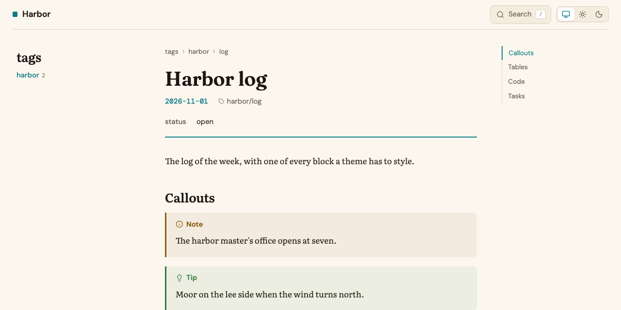
That is the whole loop: edit the theme, export, reload. Every step below repeats it.
Important
Your theme's style.css is the whole stylesheet of the pages, and the
fonts are the ones in its fonts/. A theme whose style.css you write
from an empty file gets unstyled pages, so start from
site theme init.
Warning
--force empties the output directory before writing. Point -o at a
directory that holds nothing else, outside the vault.
Step 1: Colours, light and dark
The built-in palette sits in three blocks near the top of style.css: the
light values on :root, and the dark values twice, both inside
@media screen. The first dark block applies when the system is set to
dark, unless the reader clicked the sun in the header's switch; the second
when the reader clicked the moon.
Instead of editing all three, add the harbor palette at the end of the file. Of two rules with the same selector the later one wins, so these override the values above them, and the rules that make your theme stay together at the end of the file, ready to carry over to a fresh copy:
/* Harbor: a cool, blue-grey palette with a teal accent. */

:root {
  --bg: #f6f8fa;
  --surface: #e9eef2;
  --raised: #ffffff;
  --border: #c9d3dc;
  --fg-bright: #0f1c26;
  --fg: #23323d;
  --muted: #5b6b78;
  --faint: #93a1ad;
  --accent: #0e7c86;
  --accent-soft: rgba(14, 124, 134, 0.1);
  --link: #0e7c86;
  --note-link: #0e7c86;
  --callout-note: #2f6fb0;
}

@media screen and (prefers-color-scheme: dark) {
  :root:not([data-theme="light"]) {
    --bg: #0f1820;
    --surface: #17232d;
    --raised: #1e2c38;
    --border: #2b3a47;
    --fg-bright: #eef3f7;
    --fg: #d3dde5;
    --muted: #95a5b2;
    --faint: #5f7080;
    --accent: #4fc3c9;
    --accent-soft: rgba(79, 195, 201, 0.12);
    --link: #6fd3d8;
    --note-link: #6fd3d8;
    --callout-note: #7fb2e5;
  }
}

@media screen {
  :root[data-theme="dark"] {
    --bg: #0f1820;
    --surface: #17232d;
    --raised: #1e2c38;
    --border: #2b3a47;
    --fg-bright: #eef3f7;
    --fg: #d3dde5;
    --muted: #95a5b2;
    --faint: #5f7080;
    --accent: #4fc3c9;
    --accent-soft: rgba(79, 195, 201, 0.12);
    --link: #6fd3d8;
    --note-link: #6fd3d8;
    --callout-note: #7fb2e5;
  }
}
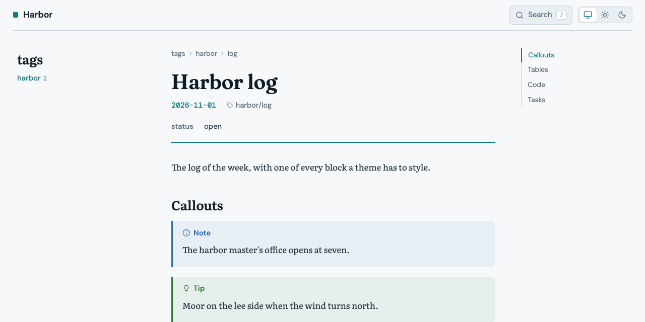
Export and reload. With the sun picked, the page is a cool grey with teal links:
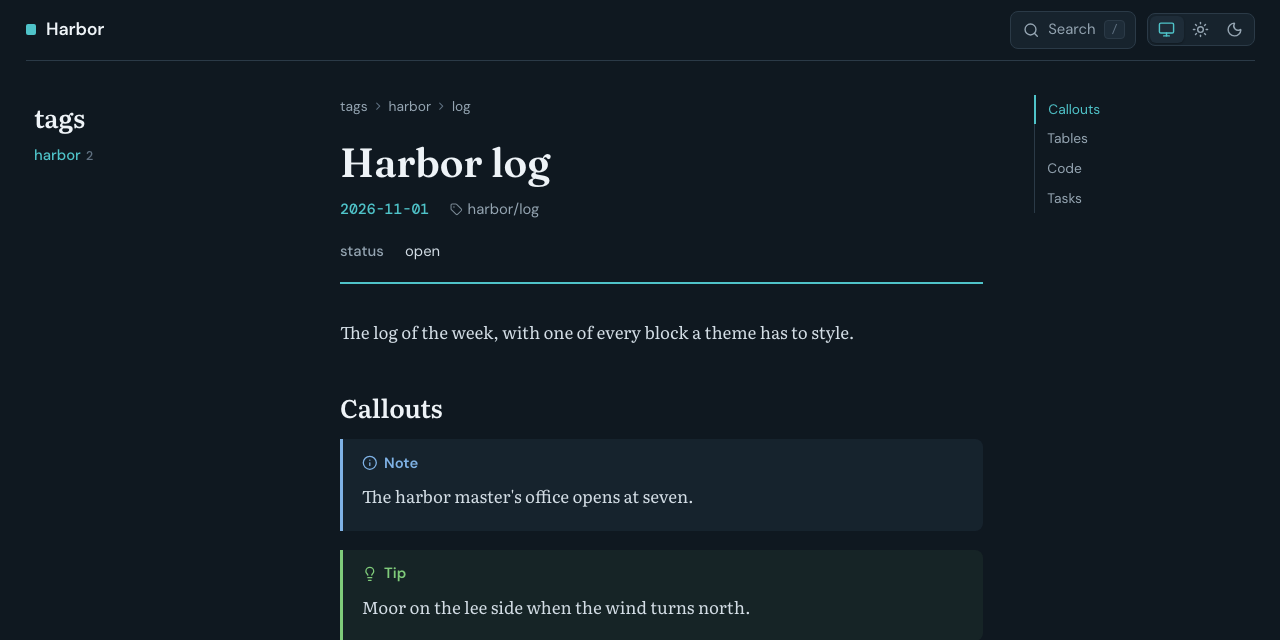
Click the moon, and the page turns blue-black with a bright teal accent:
Note
A property you leave out of the dark blocks keeps its built-in dark value, not your light one. List the same properties in all three blocks, and give both dark blocks the same values. Code keeps its token colours, which come from the highlighter, not from the palette.
Tip
Keep the dark blocks inside @media screen, as the built-in ones are. A
page then prints in the light palette whatever the scheme on screen.
Step 2: A reading face
The note bodies are set in the --serif stack, Literata in the built-in
theme. Harbor uses Atkinson Hyperlegible instead, which is under the SIL
Open Font License like the built-in faces. Download its regular, italic,
and bold files and its license into the theme's fonts/, and delete
Literata, which harbor no longer uses:
fonts=.ntropy/themes/site/harbor/fonts
base=https://cdn.jsdelivr.net/fontsource/fonts/atkinson-hyperlegible@5.3.0
curl -L -o "$fonts/atkinson-hyperlegible-400.woff2" "$base/latin-400-normal.woff2"
curl -L -o "$fonts/atkinson-hyperlegible-400-italic.woff2" "$base/latin-400-italic.woff2"
curl -L -o "$fonts/atkinson-hyperlegible-700.woff2" "$base/latin-700-normal.woff2"
curl -L -o "$fonts/OFL-atkinson-hyperlegible.txt" \
  https://cdn.jsdelivr.net/npm/@fontsource/atkinson-hyperlegible@5.3.0/LICENSE
rm "$fonts"/literata-*.woff2
Delete the two @font-face rules for Literata at the top of style.css,
then declare the new face at the end of it and put it first in the stack:
@font-face {
  font-family: "Atkinson Hyperlegible";
  font-style: normal;
  font-weight: 400;
  font-display: swap;
  src: url(fonts/atkinson-hyperlegible-400.woff2) format("woff2");
}

@font-face {
  font-family: "Atkinson Hyperlegible";
  font-style: italic;
  font-weight: 400;
  font-display: swap;
  src: url(fonts/atkinson-hyperlegible-400-italic.woff2) format("woff2");
}

@font-face {
  font-family: "Atkinson Hyperlegible";
  font-style: normal;
  font-weight: 700;
  font-display: swap;
  src: url(fonts/atkinson-hyperlegible-700.woff2) format("woff2");
}

:root {
  --serif: "Atkinson Hyperlegible", system-ui, sans-serif;
}
A url() is relative to style.css. Export and reload: the note text and
the note's headings are in Atkinson Hyperlegible, bold for the headings and
italic for emphasis and links to other notes. Bold italic has no file of
its own, so the browser makes it up. Page titles keep Fraunces, the chrome DM Sans,
and code DM Mono, the --display, --sans, and --mono stacks.
Tip
Every file in fonts/ is copied into the site's assets/ and beside
every render --to html page, whether the stylesheet uses it or not, so
deleting the faces you dropped keeps both small. fonts/LICENSE stays: it
covers the built-in faces harbor still uses.
Step 3: Corners and the accent bar
The sizes are custom properties too, named for their job. Harbor squares the corners and thickens the bar on the left of code blocks, quotes, and callouts:
:root {
  --radius-control: 2px;
  --radius-block: 2px;
  --radius-panel: 4px;
  --accent-bar: 4px;
}
Export and reload: callouts, code blocks, and the search button have sharp corners, and the bar on the callouts is a pixel wider.
Note
--measure sets the width of the reading column, 42rem in the built-in
theme. On a site page the sidebar and the outline take their space first,
so at 1280 pixels the column is narrower than 42rem already, and a wider
--measure only shows in a wider window: 46rem shows from about 1440
pixels. A render --to html page has no sidebar and shows 46rem at 1280.
Step 4: An icon of your own
Every icon is one SVG file in icons/, named for its job. A tip callout
shows lightbulb. Replace icons/lightbulb.svg with an anchor:
<svg xmlns="http://www.w3.org/2000/svg" viewBox="0 0 24 24" fill="none" stroke="currentColor" stroke-width="2" stroke-linecap="round" stroke-linejoin="round">
  <circle cx="12" cy="5" r="2"/>
  <path d="M12 7v14"/>
  <path d="M8 11h8"/>
  <path d="M4 14a8 7 0 0 0 16 0"/>
</svg>
stroke="currentColor" makes the icon take the colour of the text around
it, as the built-in icons do. Export and reload: tip callouts carry the
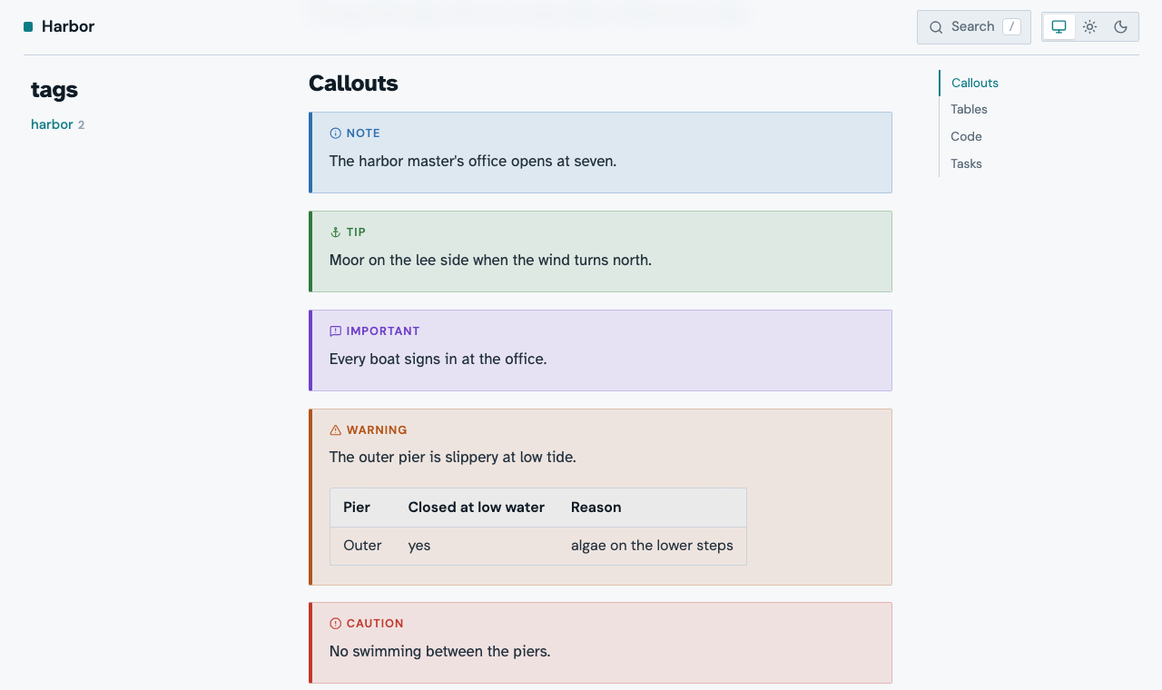
anchor, as the next step's picture shows. The names the pages use are under
Icons.
Step 5: Callouts
A callout is a div with the classes callout and callout-<kind> around
a p.callout-title and the text. Each kind sets the property --callout
to its colour. Harbor gives callouts a stronger tint, a frame, and a small,
spaced-out title:
.callout {
  background: color-mix(in srgb, var(--callout) 12%, var(--bg));
  border: 1px solid color-mix(in srgb, var(--callout) 35%, var(--bg));
  border-left: var(--accent-bar) solid var(--callout);
  border-radius: var(--radius-block);
}

.callout-title {
  font-size: 0.75rem;
  letter-spacing: 0.08em;
  text-transform: uppercase;
}

.callout,
blockquote .callout {
  --table-cover: color-mix(in srgb, var(--callout) 12%, var(--bg));
}
The last rule matters once a table sits in a callout. A table wider than its
column scrolls, and the shadow at its edges is covered by a gradient in the
colour of the ground under the table, --table-cover. A callout with a new
tint needs that colour as its cover, or the edges show light bands. The
built-in stylesheet sets the cover for a callout inside a quote with the
more specific blockquote .callout, and a rule you add later only wins over
rules as specific as itself or less, so harbor names both.
Export and reload:
Step 6: Tables
Every table sits in a div.table-wrap, and the frame, the rounded corners,
and the scrolling belong to that wrapper. Harbor tints the header row:
th {
  background: var(--accent-soft);
  color: var(--accent);
}
Export and reload: header cells are teal on a light teal ground.
Note
Open the browser's developer tools and turn on the device toolbar at 390 pixels, or narrow the window: a table of two columns turns into a stack of cards, one per row, the first cell a tinted strip over the second. The built-in stylesheet does this once the note column is narrower than 32rem.
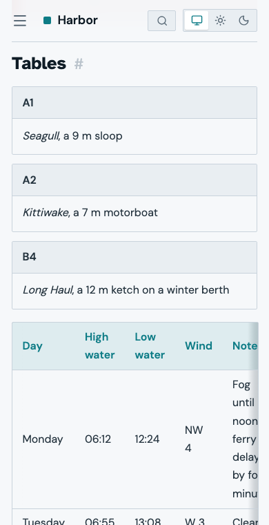
Warning
The card view needs .layout > main to be a container
(container-type: inline-size). Keep that rule if you rework the
layout, or the cards never appear. Put borders and corners on
.table-wrap, not on table.
Step 7: Header links and a footer
The pages are rendered from templates. site theme init copied the
built-in ones into templates/, and a file there replaces the built-in
template of the same name. The built-in ones are also available as
ntropy/<name>, so a template of yours can extend one and fill only its
empty blocks.
Replace the whole content of templates/page.html with:
{% extends "ntropy/page.html" %}
{% block header_nav %}{% if kind != "document" %}<nav class="site-links">
{% for link in vars.links %}<a href="{{ prefix }}{{ link.href }}">{{ link.label }}</a>
{% endfor %}</nav>{% endif %}{% endblock %}
{% block footer %}<footer class="site-footer">{{ vars.copyright }}</footer>{% endblock %}
and put the links and the footer line into .ntropy/config.toml:
[site.vars]
copyright = "Harbor office, 2026"
links = [
  { label = "Home", href = "index.html" },
  { label = "Tags", href = "tags/index.html" },
]
vars is the [site.vars] table. Pages sit at different depths, and
prefix is the ../ that leads from a page back to the site's root; an
external URL takes no prefix. A note's page is notes/<slug>.html and a
tag's tags/<tag>/index.html, so after an export the output directory shows
the path of any page you want to link. kind != "document" leaves the
links out of a render --to html page, which has no site to link into.
The links need a few lines of CSS at the end of style.css:
.site-links {
  display: flex;
  gap: 1rem;
  font-size: 0.875rem;
}

.site-links a {
  color: var(--muted);
  text-decoration: none;
}

.site-links a:hover {
  color: var(--link);
}

.site-footer {
  border-top: 1px solid var(--border);
  color: var(--muted);
  font-family: var(--sans);
  font-size: 0.8125rem;
  padding: 1.5rem var(--gutter);
  text-align: center;
}

@media (max-width: 40rem) {
  .site-links {
    display: none;
  }
}
Export and reload: the header holds Home and Tags beside the search, and every page ends with the footer.
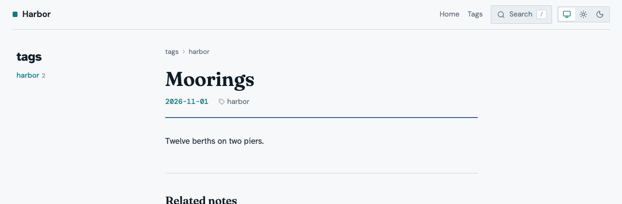
Note
On a phone the header row has room for the menu button, the site name, the search, and the switch, and nothing more. With the links in it, the site name shrinks to nothing, which is why the last rule hides the links below 40rem.
Tip
A template you delete from templates/ falls back to the built-in one.
Harbor changes only page.html, so you can delete base.html and
note.html; the pages stay the same. To see what a page hands its
template, put <pre>{{ debug() }}</pre> into the before_content
block, export, look, and take it out again.
Warning
A template that fails stops the export, naming the template and the line.
On a tag page or the generated front page note is none, so
{{ note.frontmatter.tagline }} fails there: test it with
{% if note %} first. Filling the head block replaces the stylesheet
and the scripts unless it starts with {{ super() }}.
Check your theme
Put the theme test note into your vault: a note that holds the parts of a note body a theme styles, with the note it links to and the two images it shows. Themes describes the test material and which releases carry it.
curl -fsSL https://ntropy.westhoffswelt.de/downloads/theme-test-note.tar.gz | tar xz -C "$(ntropy info -p)"
Note
In an encrypted vault, run ntropy reconcile after the download. It
encrypts the two notes the archive adds.
Export with --strict, which turns every warning into a failed exit
code, and render the theme test note as a page of its own:
ntropy site -o /tmp/harbor-site --force --strict
ntropy render --to html -o /tmp/harbor-note.html --force 'title:"Theme test note"'
The rendered page needs the harbor-note_files/ directory beside it.
Then go through the theme test note, in the site and as the rendered
page:
- Phone and desktop. Turn on the device toolbar at 390 pixels, then look at a full window. The page must not scroll sideways. A code block or a wide table scrolls inside its own box; that is expected. The sidebar sits behind the menu button, and the outline comes after the note.
- Light and dark. Click the sun and the moon in the header's switch. Text, links, callouts, and code read well in both.
- Print. Open the print preview with the moon picked. The page prints
in the light palette, the
#after the headings is gone, and wide tables print whole. - The rendered page. Open
/tmp/harbor-note.html. It has no sidebar or search, and on a phone it is one column. - The built-in look. Export the same notes with
ntropy site -o /tmp/builtin-site --force --theme defaultand compare.
Your own vault may not have every kind of page. The theme test vault does: a front page, a group page with its listing, a sidebar with a view and tags, a breadcrumb of three steps, a hidden note, a note made of words too long for a phone, and the theme test note. Download it, copy your theme into it, and export it with the theme:
curl -fsSL https://ntropy.westhoffswelt.de/downloads/theme-test-vault.tar.gz | tar xz -C /tmp
mkdir -p /tmp/theme-test/.ntropy/themes/site
cp -R .ntropy/themes/site/harbor /tmp/theme-test/.ntropy/themes/site/
open "$(ntropy --vault /tmp/theme-test site -o /tmp/theme-test-site --force --theme harbor -p)"
Its front page, Welcome, lists what each page shows and what the vault cannot show.
When you are done with the test note in your own vault, remove it again:
ntropy delete -n -f 01M6CCEVBP701HH0VPBT6ZNAYZ
ntropy delete -n -f 01M6CCEVCDRQ5504MDH503KQT2
rm -r assets/theme-test
Making a front page continues with the same theme.